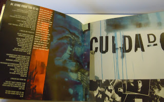
Meteora by Linkin Park is the only cd album booklet I took with me to Carlisle, and that's only because I didn't bother emptying one of my boxes when I was packing for the move.
Luckily it has full lyrics to the songs, and I've always thought it was a pretty well laid out booklet too.
The front and back are the same image folded in half. The graffiti is because the band dabbles in hip hop as well as metal.
The images, close ups of the front cover's mural, take up most of the space on the pages.
Because of the graffiti motif running through the booklet, the pages are unified by the colour blue.
I'm not too sure about the lyrics kind of shunted to the side and laid down in white.
Don't know what I would do instead, I'm so used to seeing it like this. It makes a nice contrast against the dark though.
There's a mix of photography and hand drawn imagery that gives an urban feel.
I want to add that this kind of binding is my favourite. I hate the ones you have to struggle to fold up again, like it's one big bit of paper folded in half, then lengthways about seven times or something.
Well, I struggle to anyway...maybe it's just me.


Awesome album and artwork. You never know, if Magnet of Darkness doesn't take off, Spike Minoda may come calling :D
ReplyDelete