Meteora by Linkin Park is the only cd album booklet I took with me to Carlisle, and that's only because I didn't bother emptying one of my boxes when I was packing for the move.
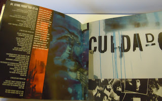
Luckily it has full lyrics to the songs, and I've always thought it was a pretty well laid out booklet too.
The front and back are the same image folded in half. The graffiti is because the band dabbles in hip hop as well as metal.
The images, close ups of the front cover's mural, take up most of the space on the pages.
Because of the graffiti motif running through the booklet, the pages are unified by the colour blue.
I'm not too sure about the lyrics kind of shunted to the side and laid down in white.
Don't know what I would do instead, I'm so used to seeing it like this. It makes a nice contrast against the dark though.
There's a mix of photography and hand drawn imagery that gives an urban feel.
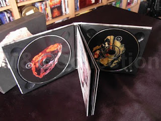
I want to add that this kind of binding is my favourite. I hate the ones you have to struggle to fold up again, like it's one big bit of paper folded in half, then lengthways about seven times or something.
Well, I struggle to anyway...maybe it's just me.
Monday, 13 February 2012
Friday, 10 February 2012
Went for a peek in the Bookcase down the road, thinking maybe classical music albums would have carefully typographed booklets and considered art for the front cover?
Naw.
I think the general idea is "bang a big fancy rennaisance painting on the front cover and slap a load of german/latin lyrics in the middle of each page of the booklet" or "get a black and white image taken at a jaunty angle of the composer/muscian/group and slap it all over the front and back. The booklet can be bare as a baby's arse"
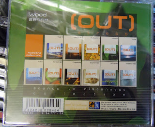
This chillout album had the funkiest cover and booklet in the entire shop. I'm going to HMV to look at proper booklets!
Selvedge Magazine
My flatmate kindly let me borrow some of her lovely costume and craft related magazines. They usually are of good quality and are printed on nice paper, so I thought I'd use them for typographical purposes.
Anne Sudworth
Anne does fantasy paintings. One of her pieces, a drawing of a woman, caught my attention.
Another painting I thought stunning was this one, because of the lighting and meticulous detail, especially when done with pastel
http://www.annesudworth.co.uk/gallery1.html
Another painting I thought stunning was this one, because of the lighting and meticulous detail, especially when done with pastel
http://www.annesudworth.co.uk/gallery1.html
re-blogged from Aisle One
 Nick Robertson designed this CD case for Brian Eno
12" square lithographic prints of Eno's artwork
"The artwork is printed on 352gsm Mohawk Superfine stock and everything is packed in a hardcover type package and features some fine foil stamping."
That's pretty.
Thursday, 2 February 2012
A band so obscure, you haven't even heard of it
Magnet of Darkness asked me to design them a t-shirt after I told them I had a screenprint induction where I would have access to screens and ink and driers.
I thought it would give an ironic twist to the bands imagery if I used a unicorn as opposed to something traditionally 'dark and menacing'
But I thought I would at least set the things tail on fire
The band members were unanimously impressed by the weird mullet/mohican.
I don't think they'll be asking me to design for them again anytime soon. No-one's bought a t-shirt yet.
Anyway, search for the band "Magnet of Darkness" on Myspace, their debut album "I'm so ironic" out on download only (so far)
Labels:
own work
Subscribe to:
Posts (Atom)


