Sunday, 29 July 2012

Massimo Carnevale


Digital paintings from Massimo Carnevale, a comic artist. His use of colour and human expression is wonderful.
He also seems to choose the less obvious scenes from films to illustrate. You know these scenes, but when you think "star wars" the cantina isn't the first thing that comes to mind, is it?

Tuesday, 3 July 2012

Paper: Tear Rip Fold Crease Cut

 Noriko Ambe; A piece of flat globe

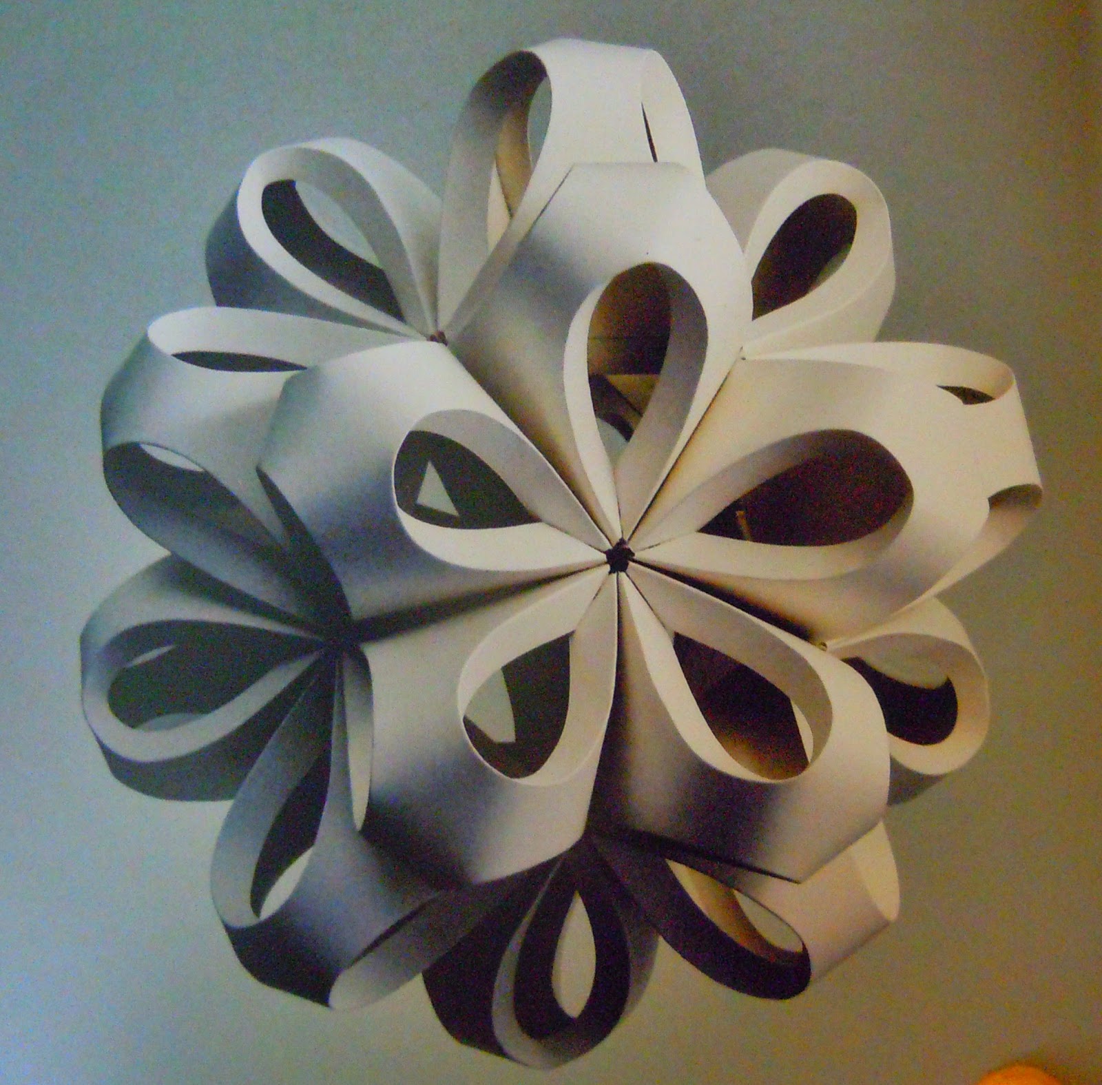
 Richard Sweeney; Icosahedron
 Mia Pearlman; Eye
 Ingrid Siliakus; Reflection on Sagrada Familia
 Peter Callesen; The short distance between time and shadow
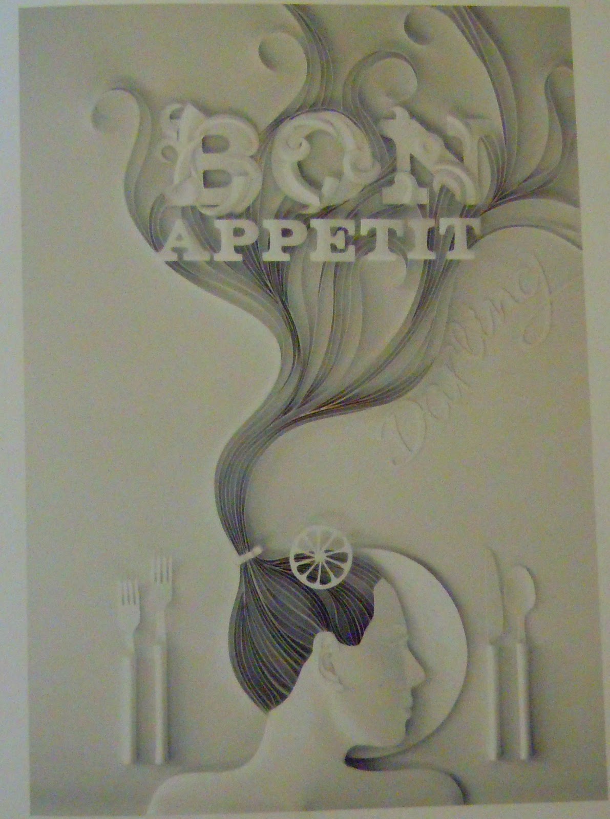
 Yulia Brodskaya; Bon Apetit
 Claire Brewster; Swallow (oh the birds)
 Kako Ueda; Gaze
 Jen Stark; Over and Out
 Won Park; Koi
Thomas Allen; Fury

Some of my favourite paper artists from the book in the title of this post. Most fold or cut, but in the last picture, Allen messes about with a pulp fiction cover to make it three dimensional.

I have to overcome my intense hatred of folding paper. Paper is not just for drawing on.

Sunday, 24 June 2012

Shaun Tan

The Arrival; a story about immigration told entirely through drawings, no words, dialogue or any typography whatsoever involved in the telling of one man's journey away from his family, across the ocean to a brand new country.
Shaun Tan uses a realistic style but creates a new world populated by weird and wonderful creatures, landscapes and cultures.

The story is inspired by stories told by immigrants including Tan's own father.
There are hints of war, holocaust, poverty and slavery in the stories told by the protagonists fellow immigrants.

The book is immensely useful for studying how close-cropping, framing, perspective, tone and expression can be used to great effect to tell a story without resorting to words.




Saturday, 2 June 2012

Arthur Rackham

 Beautiful ink work and paint. I'm especially interested in the muted colour scheme with just splashes of colour
 He really knew how to use composition. The colour is at diagonal corners of the picture.
 I don't know if it's Rackham or just the book about him, but I was charmed by the hand drawn letters with the illustrations, like the book of kells?


 Self Portrait. Look at the cropping! This is why the teachers kept nudging us towards his work.
Shadowy painterly type illustration. There weren't too many of this type in the book.

I love Arthur Rackham, especially since his biography said he was a bit shy and weird. He wasn't really the networking type, he just got on with what he was best at.

Friday, 25 May 2012

Alfred Heaton Cooper


Victorian landscape painter from Bolton
His sketches of everyday life are very nice, but his landscape paintings rock my socks. He went to Norway a few times and married a woman from there, so there are a lot of paintings of fjords and glaciers and things alongside lake district and lancashire views.

The paintings that really catch my eye are the ones with the big differences in hues or changes in light and dark.
He mostly used watercolour and oil. Not at the same time though.

Tuesday, 1 May 2012

FAYE SIMMS

http://www.arenaillustration.com/Artists/thumbsFayeSimms.html


Faye Simms went to University of Falmouth to study Illustration.
I applied there too, for the same course, but I was cruelly rejected...

(I know why now, of course)


http://www.havenforscofflaws.com/

An inspirational website full of cartoons and bits of advice thrown out in blog form.

The thing I like most about it is the mixture of traditional painted backgrounds with a computer generated cartoon in the foreground, or the ones that look like they should be computer generated because of the style, but are actually done with acrylics on paper.